Aug 5, 2020 | Biodiversity, Data and Methods, Ecosystems, Young Scientists
By Martin Jung, postdoctoral research scholar in the IIASA Ecosystems Services and Management Program.
IIASA postdoc Martin Jung discusses how a newly developed map can help provide a detailed view of important species habitats, contribute to ongoing ecosystem threat assessments, and assist in biodiversity modeling efforts.
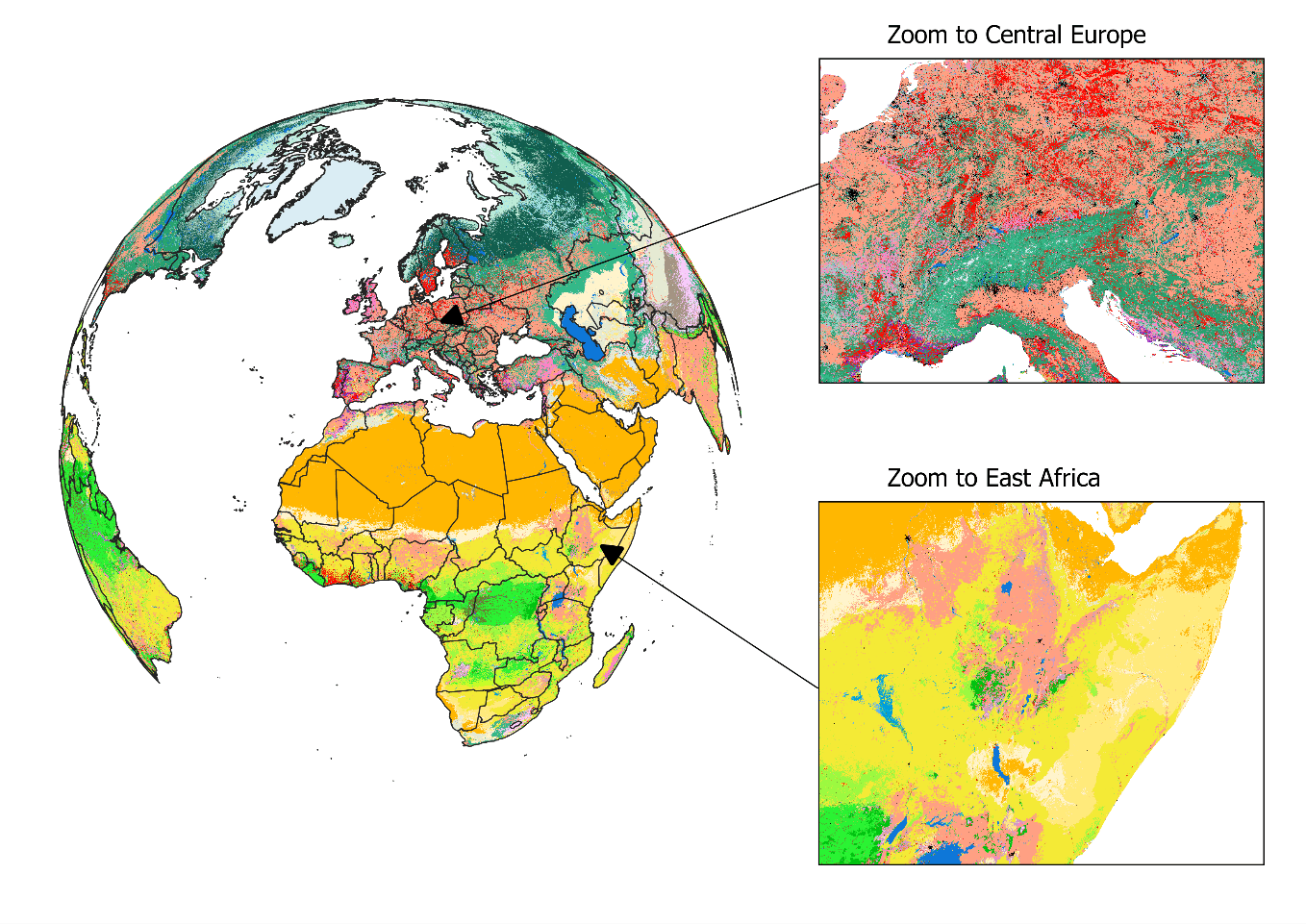
Biodiversity is not evenly distributed across our planet. To determine which areas potentially harbor the greatest number of species, we need to understand how habitats valuable to species are distributed globally. In our new study, published in Nature Scientific Data, we mapped the distribution of habitats globally. The habitats we used are based on the International Union for Conservation of Nature (IUCN) Red List habitat classification scheme, one of the most widely used systems to assign species to habitats and assess their extinction risk. The latest map (2015) is openly available for download here. We also built an online viewer using the Google Earth Engine platform where the map can be visually explored and interacted with by simply clicking on the map to find out which class of habitat has been mapped in a particular location.

Figure 1: View on the habitat map with focus on Europe and Africa. For a global view and description of the current classes mapped, please read Jung et al. 2020 or have a look at the online interactive interface.
The habitat map was created as an intersection of various, best-available layers on land cover, climate, and land use (Figure 1). Specifically, we created a decision tree that determines for each area on the globe the likely presence of one of currently 47 mapped habitats. For example, by combining data on tropical climate zones, mountain regions and forest cover, we were able to estimate the distribution of subtropical/tropical moist mountainous rain forests, one of the most biodiverse ecosystems. The habitat map also considers best available land use data to map human modified or artificial habitats such as rural gardens or urban sites. Notably, and as a first, our map also integrates upcoming new data on the global distribution of plantation forests.
What makes this map so useful for biodiversity assessments? It can provide a detailed view on the remaining coverage of important species habitats, contribute to ongoing ecosystem threat assessments, and assist in global and national biodiversity modeling efforts. Since the thematic legend of the map – in other words the colors, symbols, and styles used in the map – follows the same system as that used by the IUCN for assessing species extinction risk, we can easily refine known distributions of species (Figure 2). Up to now, such refinements were based on crosswalks between land cover products (Figure 2b), but with the additional data integrated into the habitat map, such refinements can be much more precise (Figure 2c). We have for instance conducted such range refinements as part of the Nature Map project, which ultimately helped to identify global priority areas of importance for biodiversity and ecosystem services.
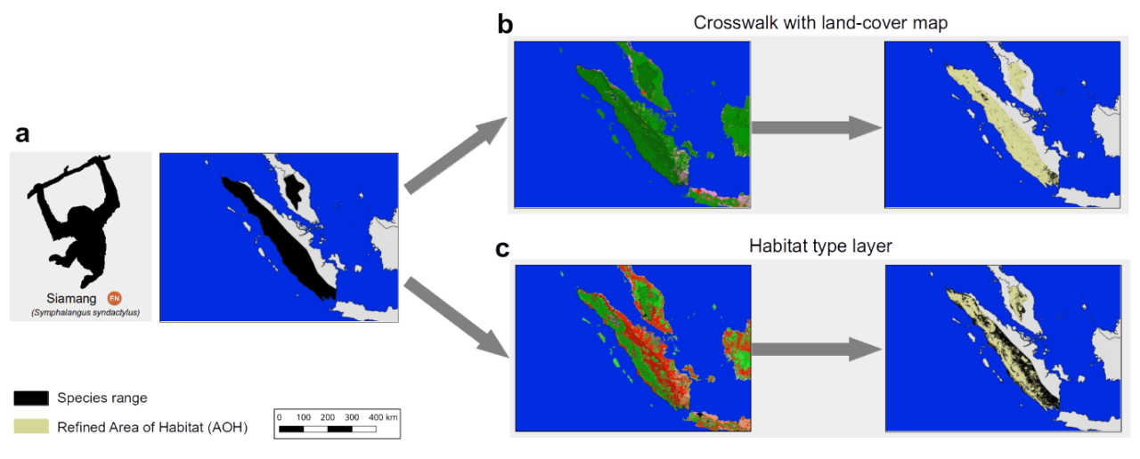
Figure 2: The range of the endangered Siamang (Symphalangus syndactylus) in Indonesia and Malaysia according to the IUCN Red List. Up to now refinements of its range were conducted based on land cover crosswalks (b), while the habitat map allows a more complete refinement (c).
Similar as with other global maps, this new map is certainly not without errors. Even though a validation has proved good accuracy at high resolution for many classes, we stress that – given the global extent and uncertainty – there are likely fine-scale errors that propagate from some of the input data. Some, such as the global distribution of pastures, are currently clearly insufficient, with existing global products being either outdated or not highly resolved enough to be useful. Luckily, with the decision tree being implemented on Google Earth Engine, a new version of the map can be created within just two hours.
In the future, we plan to further update the habitat map and ruleset as improved or newer data becomes available. For instance, the underlying land cover data from the European Copernicus Program is currently only available for 2015, however, new annual versions up to 2018 are already being produced. Incorporating these new data would allow us to create time series of the distribution of habitats. There are also already plans to map currently missing classes such as the IUCN marine habitats – think for example of the distribution of coral reefs or deep-sea volcanoes – as well as improving the mapped wetland classes.
Lastly, if you, dear reader, want to update the ruleset or create your own habitat type map, then this is also possible. All input data, the ruleset and code to fully reproduce the map in Google Earth Engine is publicly available. Currently the map is at version 003, but we have no doubt that the ruleset and map can continue to be improved in the future and form a truly living map.
Reference:
Jung M, Raj Dahal P, Butchart SHM, Donald PF, De Lamo X, Lesiv M, Kapos V,Rondinini C, & Visconti P (2020). A global map of terrestrial habitat types. Nature Scientific Data DOI: 10.1038/s41597-020-00599-8
Note: This article gives the views of the author, and not the position of the Nexus blog, nor of the International Institute for Applied Systems Analysis.
Aug 3, 2020 | Citizen Science, Data and Methods, Sustainable Development
By Dilek Fraisl, researcher in the IIASA Ecosystems Services and Management Program and chair of the WeObserve SDGs and Citizen Science Community of Practice.
How can we address the data gaps for achieving the United Nations’ Sustainable Development Goals (SDGs)? What is the potential of citizen science to track progress on the SDGs as a new source of data? How can we harness citizen science data effectively for evidence-based policymaking and SDG achievement?
These were just some of the questions we had in mind when we started research into the contributions of citizen science to SDG monitoring at the Sustainable Solutions Development Network (SDSN) Thematic Research Network on Data and Statistics (TReNDS). We were aware that citizen science has a role to play, but we didn’t know what the extent of that role would be. We wanted to show where exactly the real potential of citizen science lies in the global SDG indicator framework and also to understand what we can do to bring all the key players together to fully realize this potential.
This research led to our paper “Mapping Citizen Science Contributions to the UN Sustainable Development Goals”, which was recently published in the journal Sustainability Science.

© Litter Intelligence by Sustainable Coastlines
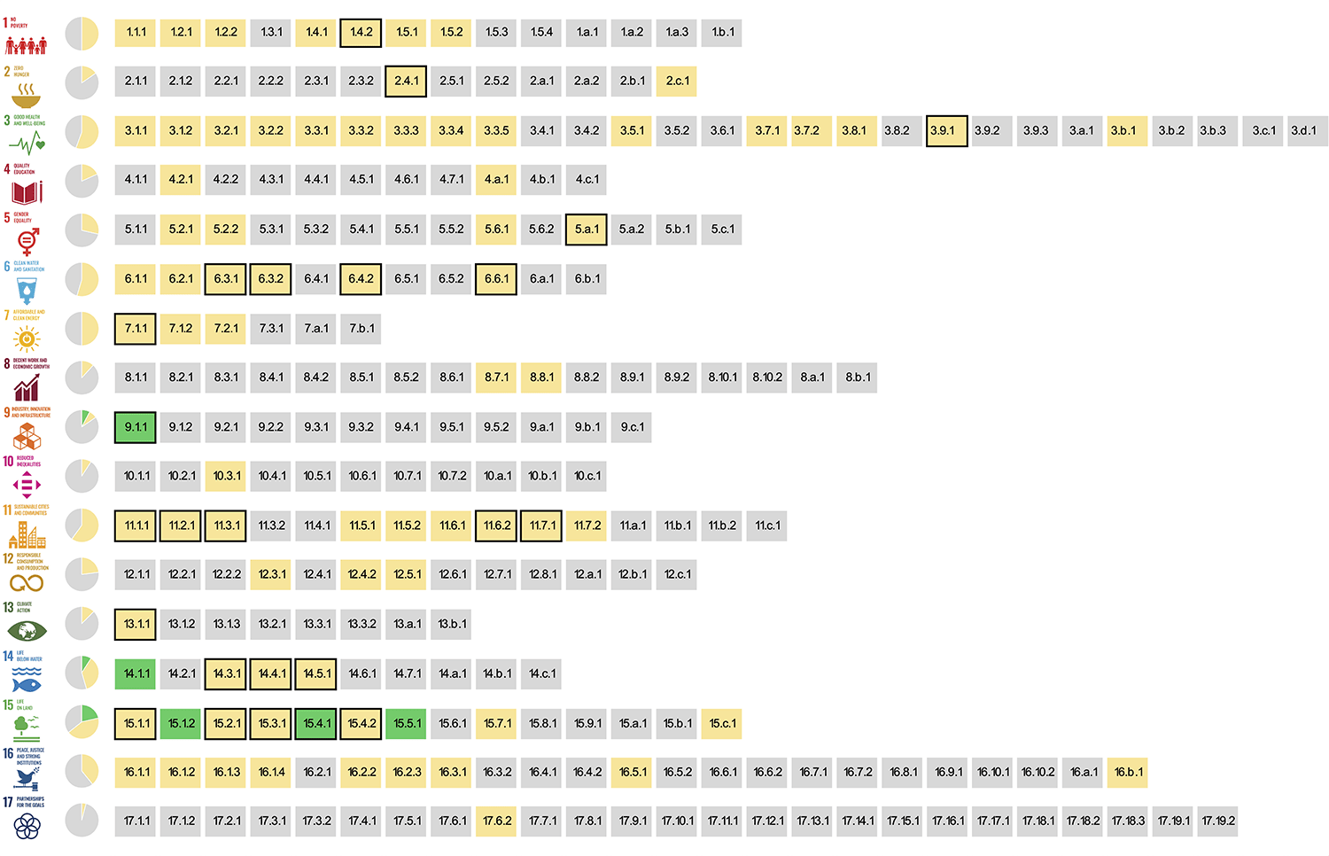
Our most remarkable finding was that citizen science could contribute to the achievement of all 17 Sustainable Development Goals (SDGs) by providing data for 33% of all SDG indicators. There are currently 247 SDG indicators that are defined in an evolving framework that includes 17 goals and 169 targets. This has huge potential.
We first investigated the metadata and work plans of all the SDG indicators and then searched for citizen science initiatives at global, national, and even local scales that could potentially contribute data to the monitoring of these indicators. This work was carried out with volunteer members of the SDGs and Citizen Science Community of Practice (SDGs CoP) that was launched a year and a half ago for the WeObserve project.
We also looked at the overlap between contributions from citizen science and earth observations in our study. Based on the mapping exercise GEO undertook of the 29 indicators identified, citizen science could support 24. This shows great potential for citizen science and earth observation approaches to complement each other. One example would be Picture Pile ̶ a flexible tool that ingests imagery from satellites, unmanned aerial vehicles (UAVs), or geotagged photos for rapid assessment and classification.
In Picture Pile, the volunteers are provided with a pair of images taken at different times and asked whether they see any tree loss (to identify deforestation), damaged buildings after a disaster (for post disaster damage assessment), marine plastics (to understand the extent of plastics problem), or to assess levels of poverty (to map poverty), among others. Picture Pile combines earth observation and citizen science approaches that could be used for monitoring some SDG indicators. To name but a few: 1.5.2 Direct economic loss attributed to disasters in relation to global gross domestic product (GDP); 11.1.1 Proportion of urban population living in slums, informal settlements, or inadequate housing; 14.1.1b Floating plastic debris density; and 15.1.1 Forest area as a proportion of total land area. Exploring and realizing this potential of citizen science and earth observation is one of our priorities at the GEO Community Activity on Citizen Science (GEO-CITSCI).
Thanks to this study, we now know which initiatives could be leveraged to contribute to SDG monitoring, and we have the groundwork to show to project teams, National Statistical Offices, and custodian agencies to start discussions around how to realize it fully.

The SDG indicators where citizen science projects are “already contributing” (in green), “could contribute” (in yellow) or where there is “no alignment” (in grey). The overall citizen science contributions to each SDG are summarized as pie charts. Black borders around indicators show the overlap between citizen science and EO, as identified by GEO (2017).
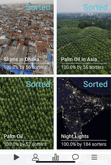
The Picture Pile application (both online and for mobile devices) is designed to be a generic and flexible tool for ingesting imagery that can then be rapidly classified by volunteers. Picture Pile, IIASA.
Another important finding of our work was that the greatest potential for citizen science ̶ when existing and potential future contributions are combined ̶ could occur respectively in SDG 15 (Life on Land), SDG 11 (Sustainable Cities and Communities), SDG 3 (Good Health and Wellbeing), and SDG 6 (Clean Water and Sanitation). This shows that citizen science has the greatest potential for input to the environmental SDG indicators.
Of the 93 environmental indicators in the SDG indicator framework identified by the United Nations Environment Programme (UNEP), citizen science could provide inputs for 37 (around 40%) indicators. As 68% of these environmental SDG indicators lack data, again identified by UNEP, also given that we only have 10 years left to achieve the SDGs, we need to start thinking about how to leverage this potential citizen science offer for SDG monitoring.
In order to effectively monitor and ultimately achieve the SDGs, traditional ways of data collection such as censuses or household surveys will not be sufficient. Additionally, they will also be too expensive to cover the wide range of the SDGs with its 169 targets and 247 indicators on a regular basis. We urgently need to act on the results of this study, and to utilize the potential of new ways of data collection such as citizen science, if we are to achieve the SDGs by 2030, but how? Where do we start?
We need to keep working on demonstrating the value of citizen science in the global data ecosystem through initiatives such as the WeObserve the SDGs CoP, building partnerships around citizen science data involving all the stakeholders, and encouraging investment to leverage the use of citizen science data for the SDGs. We should develop case studies and success stories about the use of citizen science by NSOs and design the citizen science initiatives with NSOs and other government agencies to ensure that their data quality requirements are met.
I believe it is important to mention that citizen science is not only a source of data that could fill gaps, but it is also a great way to mobilize action and get everyone on board to play their part in addressing the world’s greatest challenges by engaging the public in scientific research. Working together, we can harness the potential of citizen science to achieve the UN Sustainable Development Goals (SDGs).
This post first appeared on the Group on Earth Observations (GEO) blog.
Note: This article gives the views of the author, and not the position of the Nexus blog, nor of the International Institute for Applied Systems Analysis.
Jun 15, 2020 | COVID19, Data and Methods, Demography
By Tadeusz Bara-Slupski, Artificial Intelligence for Good initiative leader, Appsilon Data Science
Tadeusz Bara-Slupski discusses the Artificial Intelligence for Good initiative’s recent collaboration with IIASA to develop an interactive COVID-19 data visualization tool.
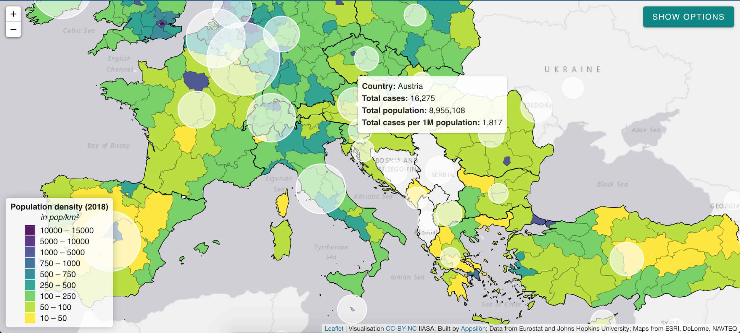
Number of hospital beds per 1000 population © IIASA
Public institutions rely on external data sources and analysis to guide policymaking and intervention. Through our AI for Good initiative, we support organizations that provide such inputs with our technical expertise. We were recently approached by IIASA to create a dashboard to visualize COVID-19 data. This builds on our previous collaboration, which had us deliver a decision-making tool for natural disaster risk planning in Madagascar. In this article, we provide an example of how to help policymakers navigate the ocean of available data with dashboards that turn these data into actionable information.
Data is useful information when it creates value…or saves lives
The current pandemic emergency has put an unprecedented strain on both public health services and policymaking bodies around the world. Government action has been constrained in many cases by limited access to equipment and personnel. Adequate policymaking can help to coordinate the emergency relief effort effectively, make better use of scarce resources, and prevent such shortages in the future. This, however, requires access to secure, timely, and accurate information.
Governments commission various public bodies and research institutes to provide such data both for planning and coordinating the response. For instance, in the UK, the government commissioned the National Health Service (NHS) to build a data platform to consolidate a number of data providers into one single source. However, for the data to be useful it must be presented in a way that is consistent with the demands of an emergency situation. Therefore, the NHS partnered with a number of tech companies to visualize the data in dashboards and to provide deeper insights. Raw data, regardless of its quality, is not useful information until it is understood in a way that creates value – or in this case informs action that could save lives.
IIASA approached us to support them in making their COVID-19 data and indicators more useful to policymakers. The institute’s research is used by policymakers around the world to make critical decisions. We appreciated the opportunity to use our skills to support their efforts by creating an interactive data visualization tool.
IIASA COVID-19 report and mapbook
Research indicates that while all segments of the population are vulnerable to the virus, not all countries are equally vulnerable at the same time. Therefore, there is a need for accurate socioeconomic and demographic data to inform the allocation of scarce resources between countries and even within countries.
IIASA responded to this need with a regularly updated website and data report: “COVID-19: Visualizing regional socioeconomic indicators for Europe”. The reader is introduced to a range of demographic, socioeconomic, and health-related indicators for European Union member countries and sub-regions in five categories:
- Current COVID-19 trends – information about the number of cases and effectiveness of policy response measures
- Demographic indicators – age, population density, migration
- Economic indicators – GDP, income, share of workers who work from home
- Health-related indicators – information about healthcare system capacity
- Tourism – number of visitors, including foreign
The indicators and data were chosen for their value in assisting epidemiological analysis and balanced policy formulation. Policymakers often face the challenge of prioritizing pandemic mitigation efforts over long-term impacts like unemployment, production losses, and supply-chain disruptions. IIASA’s series of maps and graphs facilitates understanding of these impacts while maintaining the focus on containing the spread of the virus.
Our collaboration – a dashboard for policymakers
Having taken the first step to disseminate the data as information in the form of a mapbook, Asjad Naqvi decided to make these data even more accessible by turning the maps into an interactive and visually appealing tool.
IIASA has previously approached Appsilon Data Science with a data visualization project, which had us improve the features and design of Visualize, a decision support tool for policymakers in natural disaster risk management. Building on this experience, we set out to assist Naqvi with creating a dashboard to deliver the data to end-users even faster.
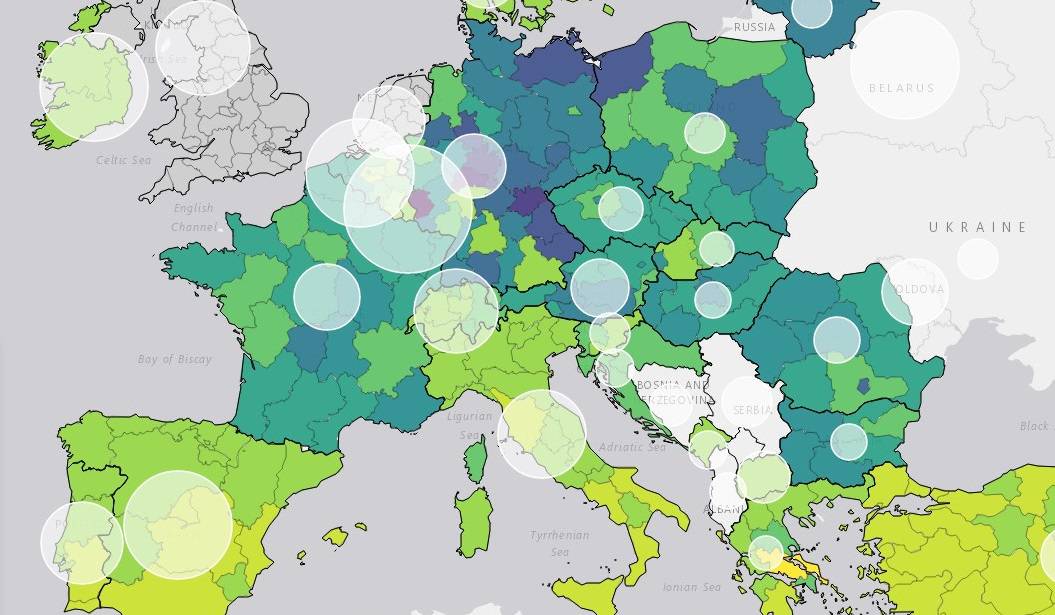
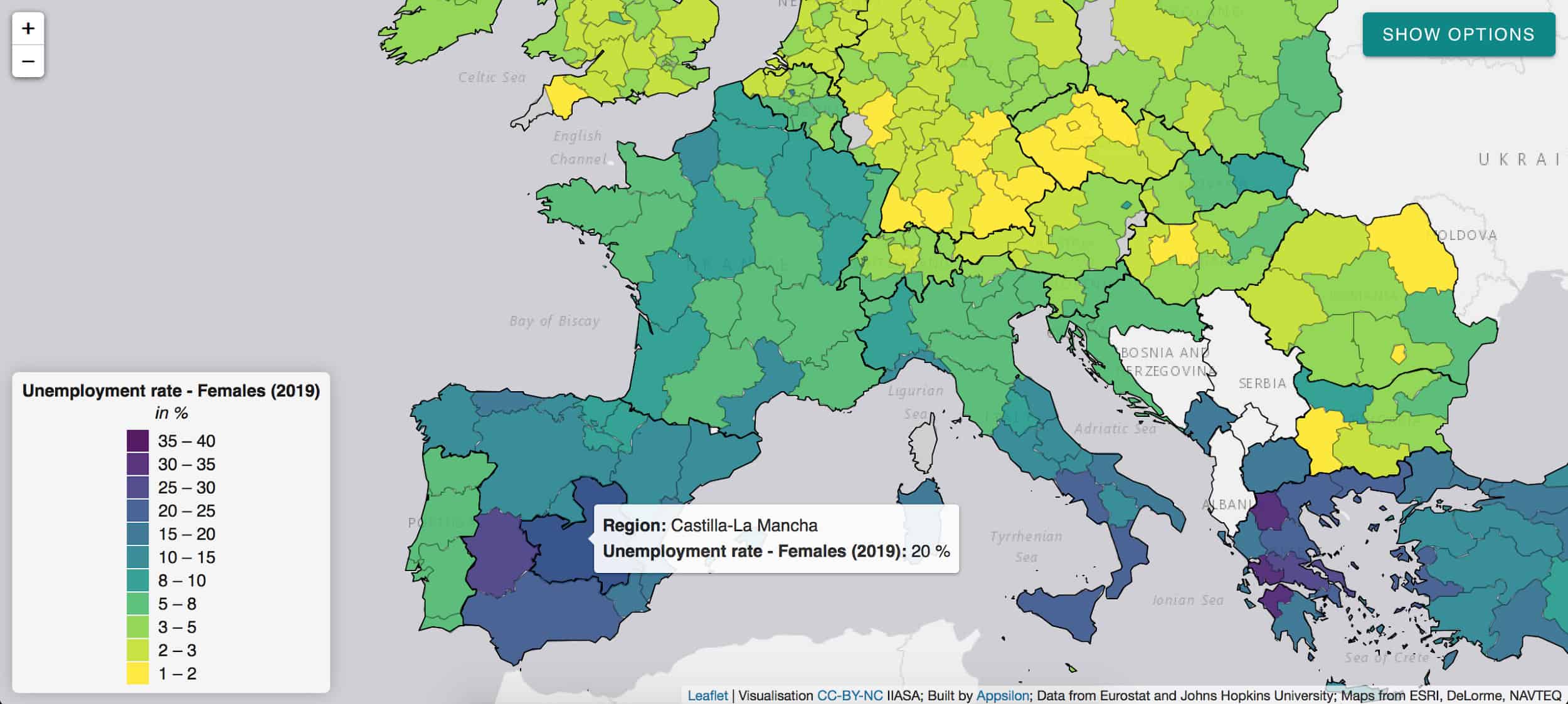
The application allows for browsing through a list of 32 indicators and visualizing them on an interactive map. The list is not final with indicators being regularly reviewed, added, and retired on a weekly basis.

White circles indicate the number of cases per 1 million citizens.
The application will continue to provide the latest and most relevant information to track regional performance in Europe also in the post-pandemic phase:
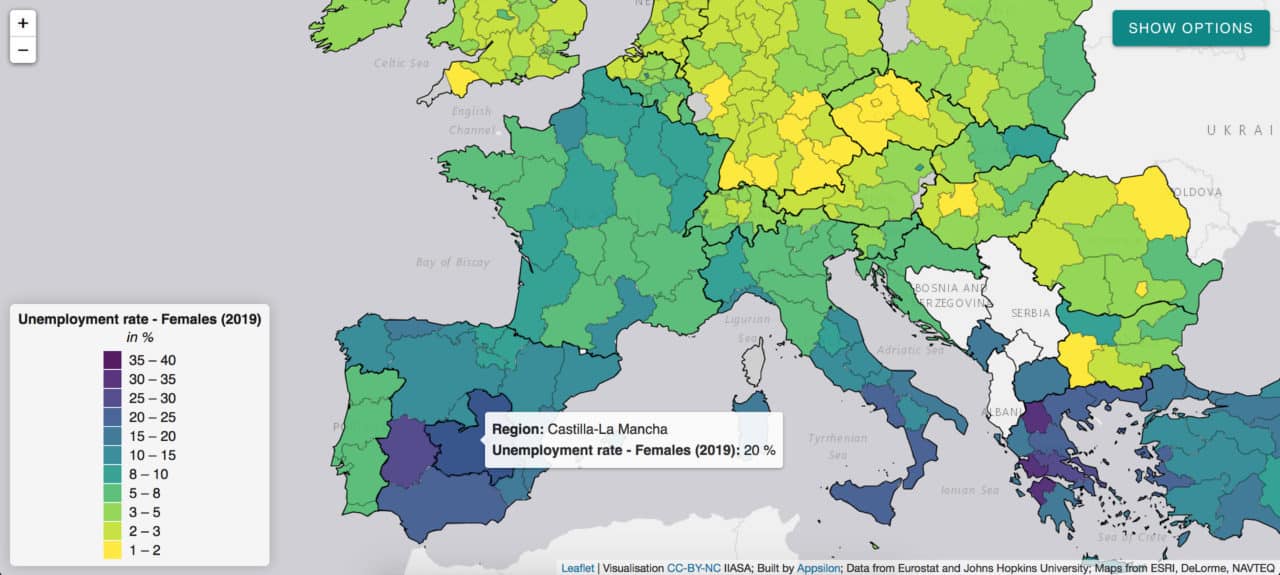
The pandemic has a disproportionate impact on women’s employment and revealed some of the systemic inequalities.
Social distancing measures, for instance, have a large impact on sectors with high female employment rates. The closure of schools and daycare facilities particularly affects working mothers. Indicators such as female unemployment rate can inform appropriate remedial action in the post-COVID world and highlight regions of special concern like Castilla-La-Mancha in Spain.
Given the urgency of the pandemic emergency, we managed to develop and deploy this application within five days. We believe such partnerships between data science consultancies and research institutes can transform the way policymakers utilize data. We are looking forward to future collaborations with IIASA and other partners to help transform data into accessible and useful information.
This project was conducted as part of our Artificial Intelligence for Good initiative. The application is available to explore here.
Note: This article gives the views of the author, and not the position of the Nexus blog, nor of the International Institute for Applied Systems Analysis.
Apr 22, 2020 | COVID19, Data and Methods
By Santosh Karanam, .NET Full Stack Developer in the IIASA Ecosystems Services and Management Program
Santosh Karanam describes his efforts to visualize people’s reactions to the easing of COVID-19 restrictions in real time as they are expressed on Twitter.

© Ezthaiphoto | Dreamstime.com
Who would have imagined at the beginning of 2020, when the United Nations Department of Economic and Social Affairs was still projecting global economic growth at 2.5%, that within a few months the same department would have to release a new briefing stating that the global economy is now projected to shrink by 0.9% in 2020 due to a pandemic. This is mainly due to sudden restrictions and disruptions in global supply chains and international trade. COVID-19 is already having a lasting impact on the global economy; nearly 100 countries have closed their national borders during the past month, and the movement of people and tourism flows have come to a screeching halt.
In some countries, the COVID-19 pandemic has peaked in terms of the number of new infections, however, many countries are yet to reach the peak. Countries that seem to have crossed the peak are looking for ways to lift restrictions gradually, while keeping an eye on infection rates to avoid a second wave of infections. These actions by governments are being watched closely by people around the globe and trigger various kinds of emotional reactions.
Visualizing Twitter reactions in real time
I was curious about the possibility of visualizing these reactions, or sentiments, on a real-time basis as we crawl through these unprecedented times of the COVID-19 pandemic. It led me to create a real-time dashboard to visualize sentiments about the lifting of pandemic restrictions expressed or evident on the social media platform Twitter.
Twitter has application program interfaces (APIs) that enable developers to pull data from Twitter in a machine-readable format. This data is the same as the data shown when you open your Twitter account in either a browser or a mobile application and search for specific words. I decided to utilize this data using search key words like “lifting lockdown” and ”lifting restriction” and assign sentiment scores to tweets relating to these keywords using sentiment140.
Sentiment140 is a program created by computer science graduates from Stanford University that allows you to discover the sentiment of a brand, product, or topic on Twitter. It automatically classifies the sentiment of Twitter messages by using classifiers built using machine learning algorithms, and provides transparency for the classification results of individual tweets. Twitter uses complex algorithms to get the results for key words. These tweets are pulled continuously in real time and sent to sentiment140 APIs where they are assigned sentiment scores: 0 for negative, 2 for neutral and 4 for positive.
Below is an example of this scoring:
|
Tweet
|
Scores |
Sentiment |
| Why are people so eager to end lockdown and lift restrictions… for a second wave and then moan again… the mind boggles!! |
0 |
Negative |
| Iran begins lifting restrictions after brief coronavirus lockdown |
2 |
Neutral |
| Germany has now begun to lift restrictions to visit one another and open businesses soon because we actually listened and stayed at home. Germany has now been marked the 2nd Safest country during the pandemic |
4 |
Positive |
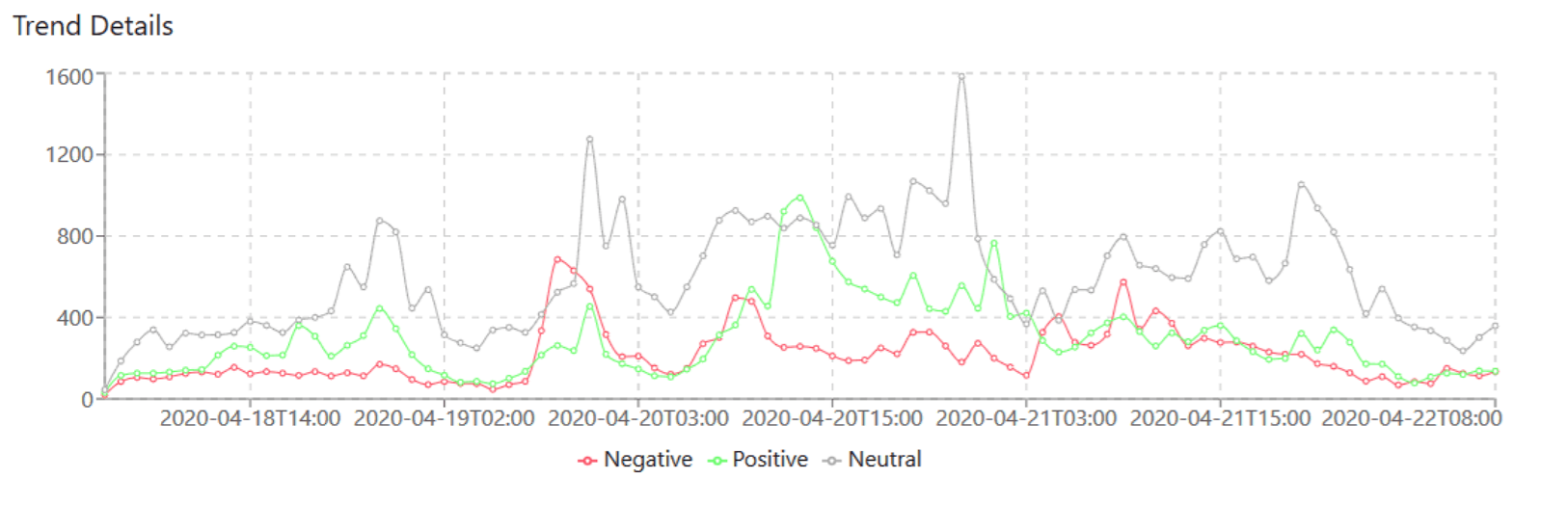
From April 12th 2020 to April 21st 2020, a total of 208,220 tweets were scored and analyzed, this total number of tweets is growing daily as new tweets come in. The tweets are analyzed (sentiment scored) in real time and aggregated hourly. The above examples are taken from the analyzed tweets. For simplicity and to have a wholistic view of all relevant tweets, replies to tweets and re-tweets are all scored as people may react days after the initial tweet. For this experiment, only English language tweets are considered.
The scores assigned are aggregated every hour, stored in cloud storage, and are shown in the website dashboard. The dashboard shows the status of the current day’s scores and is updated every hour, it also shows the previous four days’ sentiment score results.
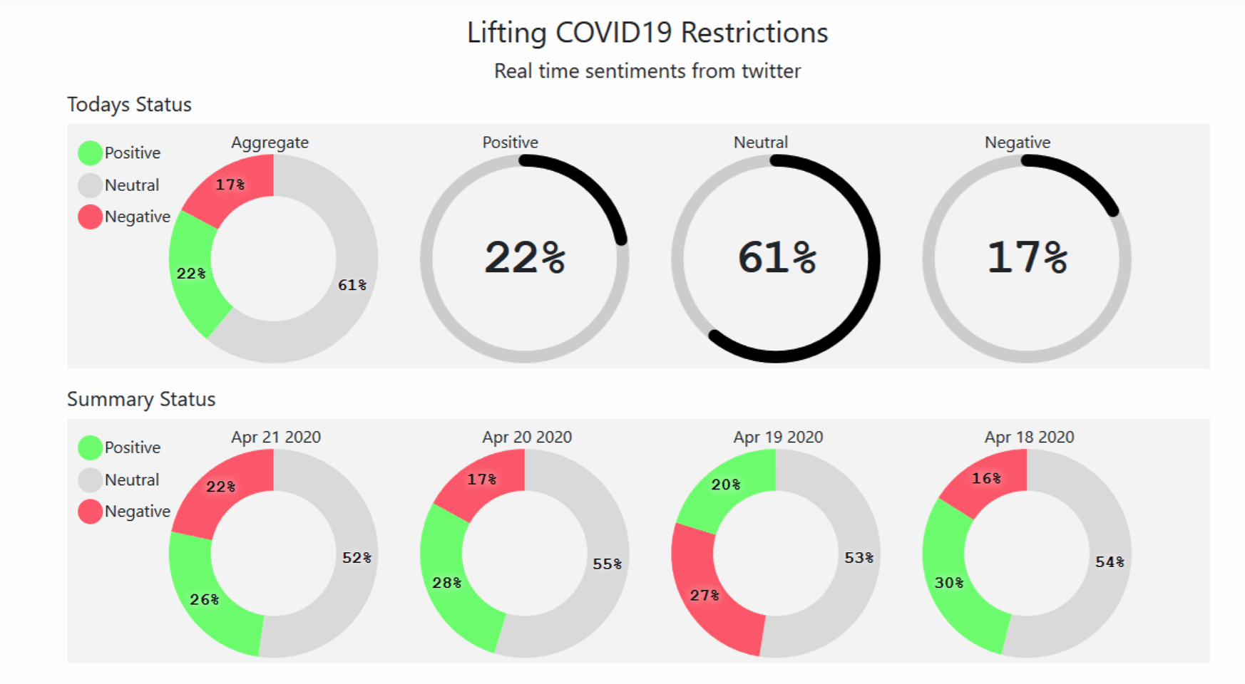
Visit the website and see the dashboard.
Trends so far:
I can see a trend where most of the tweets fall under neutral scores as we are in the early days of restrictions being lifted. Many people are concerned about whether the measures will work. As the days progress I expect the neutral scores to reduce and convert into either positive or negative scores. This all depends on how infection rates either rise or fall in the days to come. Ideally, if everything turns out as planned, the positive sentiments will grow, and negative and neutral sentiments will shrink.
The scored tweets are not country specific but are captured globally, the reason being that less than 1-2% of Tweets are geo-tagged and for a real time experiment, I thought it would be too little data per hour. Since very few countries have crossed the peak of the curve, the current results show that the neutral and negative scores form the major share as we progress and hopefully, if infection rates do not increase drastically with the ease of lockdown restrictions, we might see positive sentiment scores taking the major share.
Additional info:
This is a sample experiment that I am running in the Microsoft Azure cloud using Azure Event Hubs and Azure Stream Analytics for real-time processing of Twitter data. I am storing the aggregated score results in Azure Blob Stores – you can read more about the setup here. The aggregated results are shown using a simple react java script application, which is again hosted in Microsoft Azure cloud. Do contact me for further details.
References
- https://www.un.org/sustainabledevelopment/blog/2020/04/covid-19-likely-to-shrink-global-gdp-by-almost-one-per-cent-in-2020/
- https://news.un.org/en/story/2020/04/1061782
- http://help.sentiment140.com/home
- https://developer.twitter.com/en
- https://docs.microsoft.com/en-us/azure/stream-analytics/stream-analytics-twitter-sentiment-analysis-trends
Note: This article gives the views of the author, and not the position of the Nexus blog, nor of the International Institute for Applied Systems Analysis
Apr 2, 2020 | COVID19, Data and Methods, Finland, Health, Sustainable Development, Systems Analysis
By Leena Ilmola-Sheppard, senior researcher in the IIASA Advanced Systems Analysis Program.
Leena Ilmola-Sheppard discusses the value of employing novel research methods aimed at producing fast results to inform policies that address immediate problems like the current COVID-19 pandemic.

© Alberto Mihai | Dreamstime.com
As researchers, the majority of our work – even if it is applied research – requires deep insight and plenty of reading and writing, which sometimes takes years. When we initiate a new method development project, for example, we never know if it will eventually prove to be useful in real life, except on very rare occasions when we are willing to step out of our academic comfort zones and explore if we are able to address the challenges that decision makers are faced with right now.
I would like to encourage my colleagues and our network to try and answer the call when decision makers ask for our help. It however requires courage to produce fast results with no time for peer review, to explore the limits of our knowledge and capabilities of our tools, and to run the risk of failure.
I share two examples with you in this blog. The first one describes a situation that played out years ago, while the second one is happening today.
When the first signs of a potential refugee crisis became visible late in 2014, the Finnish Prime Minister’s Office contacted the IIASA Advanced Systems Analysis Program (ASA) and asked whether we could produce an analysis for them. The ASA team had an idea to develop a new method for qualitative systems analysis based on an application of causal-loop-diagrams and we decided to test the approach with an expert team of 14 people from different Finnish ministries. I have to admit that the process was not exactly the best example of rigorous science, but it was able to produce results in only eight weeks.
“Experts that participated in the process from the government side accepted that the process was a pilot and exploratory in nature. In the end, the group was however able to develop a shared language for the different aspects of the refugee situation in Finland. The method produced comprised a shared understanding of the events and their interdependencies and we were able to assess the systemic impact of different policies, including unintended consequences. That was a lot in that situation,” said Sari Löytökorpi, Secretary General and Chief Specialist of the Finnish Prime Minister’s Office when reflecting on that experience recently.
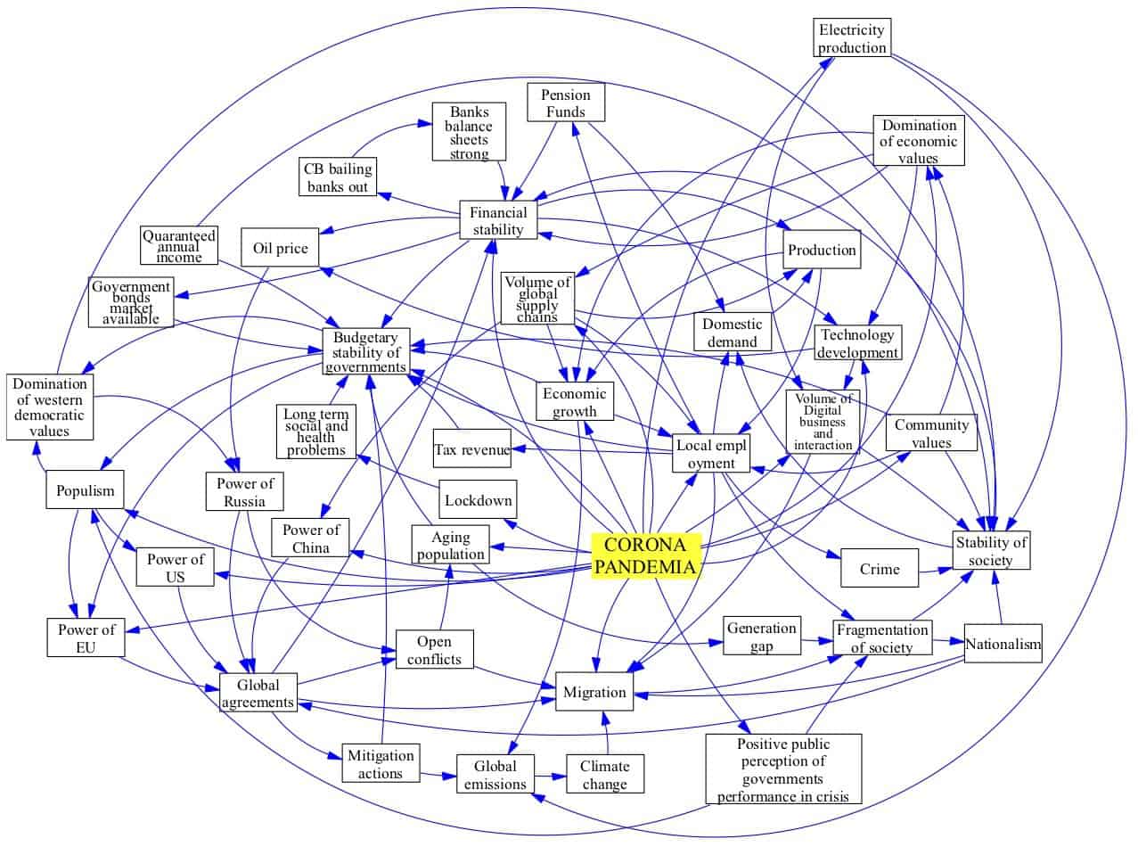
The second case I want to describe here is the current coronavirus pandemic. The COVID-19 virus reached Finland at the end of January when a Chinese tourist was diagnosed. The first fatality in Finland was recorded on 20 March. This time, the challenge we are presented with is to look beyond the pandemic. The two research questions presented to us by the Prime Minister’s Office and the Ministry of Economic Affairs are: ‘How can the resilience of the national economy be enhanced in this situation?’ and secondly ‘What will the world look like after the pandemic?’
Pekka Lindroos, Director of Foresight and Policy Planning in the Finnish Ministry of Economic Affairs is confident, “We know that the pandemic will have a huge impact on the economy. The global outcome of current national policy measures is a major unknown and traditional economic analysis is not able to cover the dynamics of the numerous dimensions of the rupture. That is why we are exploring a combination of novel qualitative analysis and foresight methods with researchers in the IIASA ASA Program.”
I have been working on the implementation of the systems perspective to the coronavirus situation with a few close colleagues around the world who are experts in resilience and risk. We were able to deliver the first report on Friday, 27 March. Among other things, it emphasized the role of social capital and society’s resilience. A more detailed report is currently in production.
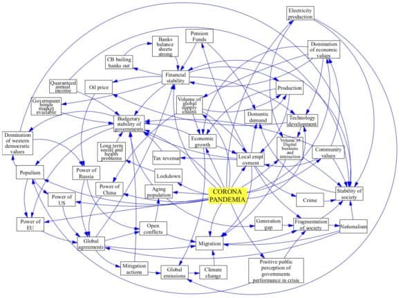
A simple systems map (causal loop diagram) representing a preliminary understanding of the world after COVID-19 from a one country perspective.
Note: This article gives the views of the author, and not the position of the Nexus blog, nor of the International Institute for Applied Systems Analysis.
Aug 8, 2019 | Data and Methods, Economics, IIASA Network, Russia
By Serguei Kaniovski, Economist with the Austrian Institute of Economic Research (WIFO)
Serguei Kaniovski and colleagues from IIASA and the Steklov Mathematical Institute of the Russian Academy of Sciences revisited a classic growth model in resource economics using recent advances in optimal control theory.
The late 1960s and early 1970s gave rise to Doomsday Models that predicted a collapse of Western Civilization under the pressure of over-population and environmental pollution. The very influential 1972 Club of Rome’s report on the “Limits to Growth” painted a gloomy picture, sparking an ongoing debate. One question was whether the scarcity of natural resources like fossil fuels would limit growth and cause a substantial decline in people’s standard of living.
The Doomsday reasoning was met with doubt by the economists of that time, leading the future Nobel Prize laureate and growth theorist, Robert Solow, to state that “the various Doomsday Models are worthless as science and as guides to public policy“. In a combined effort, economists developed a class of growth models with resource constraints. The conclusions they reached using the Dasgupta-Heal-Solow-Stiglitz (DHSS) modeling framework offered a more optimistic outlook.

© Kantver | Dreamstime.com
Economic applications have been well ahead of the mathematical theory used for identifying optimal economic policies, leaving some model solutions unexposed and some technical issues unsettled. The theory that allows us to identify optimal policies and describe the model dynamics was originally developed in the 1950s for engineering applications but has since become the main tool for analyzing economic growth models. These models however contain many features that are not standard to optimal control theory – a subfield of mathematics that deals with the control of continuously operating dynamic systems – which makes a fully rigorous analysis difficult. The key theoretical challenges are infinite planning horizons and nonstandard control constraints.
In our latest paper we offer a complete and rigorous analysis of the welfare-maximizing investment and depletion policies in the DHSS model with capital depreciation and arbitrary (decreasing, constant, and increasing) returns to scale. The investment policy specifies the portion of the final output to be invested in capital. A depletion policy says how fast a finite stock of exhaustible resources should be used. We prove the existence of a solution and characterize the behavior of solutions for all combinations of the model parameters using necessary rather than sufficient (Arrow’s theorem) optimality conditions.
In the main case of decreasing, constant, or weakly increasing returns to scale, the optimal investment and depletion policies converge to a constant share of output invested in capital and a constant rate of depletion of the natural resource. The optimal investment ratio decreases with the longevity of capital and impatience. The relationship between the optimal investment ratio and the output elasticity of produced capital is ambiguous. The performed analytical analysis identifies those relationships among model parameters that are critical to the optimal dynamics. In this, it differs from more conventional scenario-based approaches. From a practical point of view, application of the model to real data could be helpful for evaluating actual depletion and investment policies.
Strongly increasing returns to scale make it optimal to deplete the resource without investing in produced capital. Whether a zero-investment strategy is followed from the outset, from an instant of time, or asymptotically will depend on the sizes of the capital and resource stocks. In some special cases of increasing returns, welfare-maximizing investment and extraction policies may not exist under strong scale effects in resource use. This occurs when an initial stock of capital is small relative to the initial resource stock. It implies that it would have been impossible to formulate a welfare-maximizing policy in the early history of humanity, when produced capital was scarce and resources were abundant.
Reference
Aseev S, Besov K, & Kaniovski S (2019). Optimal Policies in the Dasgupta—Heal—Solow—Stiglitz Model under Nonconstant Returns to Scale. Proceedings of the Steklov Institute of Mathematics 304 (1): 74-109. [pure.iiasa.ac.at/15946]
Note: This article gives the views of the author, and not the position of the Nexus blog, nor of the International Institute for Applied Systems Analysis.

You must be logged in to post a comment.