Dec 16, 2021 | Alumni, Demography, Poverty & Equity, Women in Science, Young Scientists
By Fanni Daniella Szakal, 2021 IIASA Science Communication Fellow
Can we lift people out of energy poverty while simultaneously reducing carbon dioxide emissions? 2021 Young Scientists Summer Program (YSSP) participant Camille Belmin tried to tackle this seemingly contradictory issue by including fertility in the equation and estimating the conditions where an increase in energy access would reduce demand through decreasing population sizes.

© Photopassion77 | Dreamstime.com
About every third person in the world today doesn’t have access to clean cooking fuels and 1 in 10 are without electricity, predominantly in the Global South. Increasing energy access will not only improve the quality of life for many, but it will also propel us towards achieving some of the UN Sustainable Development Goals (SDGs) such as SDG3, Good Health and Wellbeing, and SDG7, Access to Clean and Affordable Energy.
The downside of increasing energy access is the surge in carbon dioxide emissions that will likely follow. Although populations with low energy access emit only a small share of global carbon emissions compared to countries in the Global North, an increase in energy provisioning would still put more pressure on the climate crisis. But, what if we could increase energy access and decrease emissions at the same time while tackling a few more SDGs in the process, such as SDG5, Gender Equality and SDG13, Climate Action?
Camille Belmin, a participant in the 2021 YSSP aimed to do just that. As a PhD Student at the Potsdam Institute for Climate Impact Research (PIK) and at the Humboldt University of Berlin, Belmin focuses on the relationship between energy access and women’s fertility. In a previous study covering 43 countries around the globe, she found evidence that higher access to electricity and modern cooking fuels was associated with women having fewer children.
“With more access to energy, instead of, for example, picking up firewood for many hours a day, women are able to spend more time on education and employment. Energy access also lowers the need for child labor and reduces child mortality through reduction of indoor air pollution and improved healthcare. This often leads to women becoming more empowered and gives them agency over their reproductive choices, leading to a fertility decline,” says Belmin.
In her YSSP project, Belmin took the energy-fertility relationship a step further: she wanted to explore if an initial boost in energy access could lead to a decline in energy demand in the long term through reduced population sizes, both increasing the quality of life and reducing carbon dioxide emissions.
“I hope that by showing that universal access to energy can also have benefits for sustainability, I can encourage investments in modern energy access in countries where basic services are lacking,” she notes.
To find out under which conditions increasing energy access will lead to a decrease in energy demand, Belmin used a microsimulation model of population projection. Under different energy access scenarios, the model follows each individual in a hypothetical population through life events, such as birth, death, and gaining access to education and electricity, while calculating their total energy consumption. She hoped to find a scenario with net savings in energy demand, in other words, a scenario where the more you give, the more you get.
Setting up the model was a new challenge for Belmin ̶ while many scientific fields have been using microsimulation for a long time, applying it to population modeling based on energy access is a novelty. The potential benefits and positive implications of the work were however well worth the difficulty.
The study focused on population simulations in Zambia, where Belmin collaborates with an NGO that aims to finance education for girls through carbon credits, building on the idea that education will lead to lower population sizes and decreased emissions in the future.
“Because of patriarchal structures, women are often bound to household chores, making the lack of energy a huge burden,” says Belmin. “This research is very important to me as a woman, or just as a human, as it seems that providing modern energy services might be a way for women to have more choice and freedom in their lives.”
Further information:
Belmin, C. (2021). Introducing the energy-fertility nexus in population projections: can universal access to modern energy lead to energy savings? IIASA YSSP Report. Laxenburg, Austria: IIASA [pure.iiasa.ac.at/17688]
Note: This article gives the views of the author, and not the position of the Nexus blog, nor of the International Institute for Applied Systems Analysis.
Nov 26, 2021 | Demography, Environment, Finland, IIASA Network, Poverty & Equity
By Venla Niva, DSc researcher with the Water and Development Research Group, School of Engineering, Aalto University, Finland
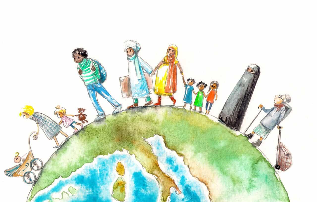
Venla Niva shares insights from a recent article exploring the interplay of environmental and social factors behind human migration. The project was carried out in collaboration with Raya Muttarak from the IIASA Population and Just Societies Program.
© Irina Nazarova | Dreamstime.com
Environmental migration has gained increasing attention in the past years, with recent climate reports and policy documents highlighting an increase in environmental refugees and migrants as one of the potential effects of the warming globe. Policymaking is dominated by a narrative that portrays environmental migration as a security threat to the “Global North”. Meanwhile, researchers around the world have put enormous efforts into understanding environmental migration and what is driving it. Yet, the causes and effects of environmental migration remain under debate.
In our latest paper, we extend the understanding of environmental migration by looking into how environmental and societal factors interacted in places of excess out- or in-migration between 1990 and 2000. We found that understanding these interactions is key for understanding migration drivers. Ultimately, migration is based on human decision-making, and in our view “simply cannot and should not be studied without the inclusion of the societal dimension: human capacity and agency.” Our findings were both expected and, to a certain degree, surprising.
Our results show that the majority of global migration takes place in areas with rather similar profiles. It is known that migration mostly occurs over short distances, and that internal migration – in other words, people moving around in their own country – outplays international migration – people moving between countries – by significant numbers globally. This, however, shows that the characteristics of these areas are alike too. High environmental stress coupled with low-to-moderate human capacity characterized these areas at both ends of migration. Such characteristics portray a combination of variables with a high degree of drought and water risks, natural hazards, and food insecurity, but low levels of income, education, health, and governance.
We found that income was the best variable to explain the variation of net-negative and net-positive migration in around half of the countries, globally, confirming that income is a good predictor of migration. This is interesting in two ways. According to traditional migration theories, income disparity between regions is seen as the primary driver for migration. Yet, income only dominated the other variables in half of the countries we examined. Education and health were especially important in areas with more out-migration than in-migration. Drought and water risks were important explaining factors in many countries, but were outranked by societal factors such as income, health, education, and governance in the majority of countries.
In light of our research, we would like to point out that it is unlikely that environmental factors alone would be responsible for migration. Instead, the role of human agency is vital. Investments in building human capacity have two-fold benefits: First, higher human capacity facilitates not only local adaptation to changes in the environment, but also adaptation at the destination in case of migrating. Second, protecting ecosystems and the environment helps to mitigate and adapt to climate and environmental change in areas with high environmental stress, which is again crucial for maintaining livelihoods and a good life at both ends of migration.
Environmental migration is often portrayed by the media as a catastrophic phenomenon. Our study confirms that migration drivers are a result of the interactions between socioeconomic and environmental factors and that human capacity plays a central role in both enabling the migration process and adaptation at the place of destination.
Further info:
Niva, V., Kallio, M., Muttarak, R., Taka, M., Varis, O., & Kummu, M. (2021). Global migration is driven by the complex interplay between environmental and social factors. Environmental Research Letters DOI: 10.1088/1748-9326/ac2e86. [pure.iiasa.ac.at/17507]
Note: This article gives the views of the author, and not the position of the Nexus blog, nor of the International Institute for Applied Systems Analysis.
Jun 15, 2020 | COVID19, Data and Methods, Demography
By Tadeusz Bara-Slupski, Artificial Intelligence for Good initiative leader, Appsilon Data Science
Tadeusz Bara-Slupski discusses the Artificial Intelligence for Good initiative’s recent collaboration with IIASA to develop an interactive COVID-19 data visualization tool.
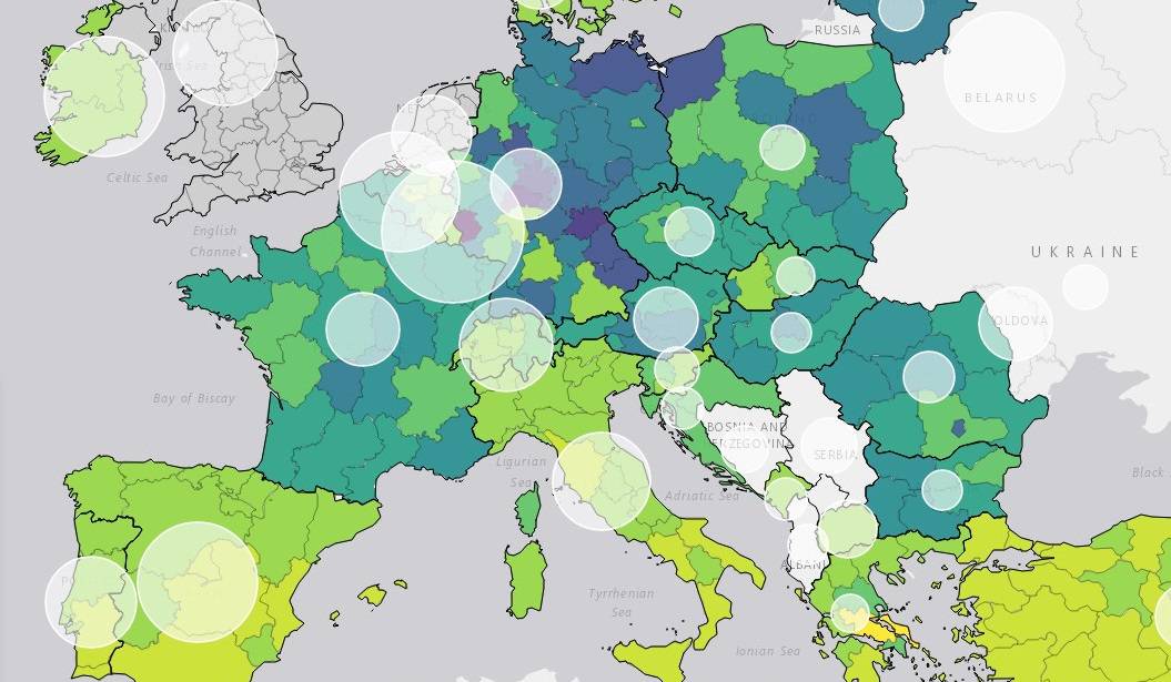
Number of hospital beds per 1000 population © IIASA
Public institutions rely on external data sources and analysis to guide policymaking and intervention. Through our AI for Good initiative, we support organizations that provide such inputs with our technical expertise. We were recently approached by IIASA to create a dashboard to visualize COVID-19 data. This builds on our previous collaboration, which had us deliver a decision-making tool for natural disaster risk planning in Madagascar. In this article, we provide an example of how to help policymakers navigate the ocean of available data with dashboards that turn these data into actionable information.
Data is useful information when it creates value…or saves lives
The current pandemic emergency has put an unprecedented strain on both public health services and policymaking bodies around the world. Government action has been constrained in many cases by limited access to equipment and personnel. Adequate policymaking can help to coordinate the emergency relief effort effectively, make better use of scarce resources, and prevent such shortages in the future. This, however, requires access to secure, timely, and accurate information.
Governments commission various public bodies and research institutes to provide such data both for planning and coordinating the response. For instance, in the UK, the government commissioned the National Health Service (NHS) to build a data platform to consolidate a number of data providers into one single source. However, for the data to be useful it must be presented in a way that is consistent with the demands of an emergency situation. Therefore, the NHS partnered with a number of tech companies to visualize the data in dashboards and to provide deeper insights. Raw data, regardless of its quality, is not useful information until it is understood in a way that creates value – or in this case informs action that could save lives.
IIASA approached us to support them in making their COVID-19 data and indicators more useful to policymakers. The institute’s research is used by policymakers around the world to make critical decisions. We appreciated the opportunity to use our skills to support their efforts by creating an interactive data visualization tool.
IIASA COVID-19 report and mapbook
Research indicates that while all segments of the population are vulnerable to the virus, not all countries are equally vulnerable at the same time. Therefore, there is a need for accurate socioeconomic and demographic data to inform the allocation of scarce resources between countries and even within countries.
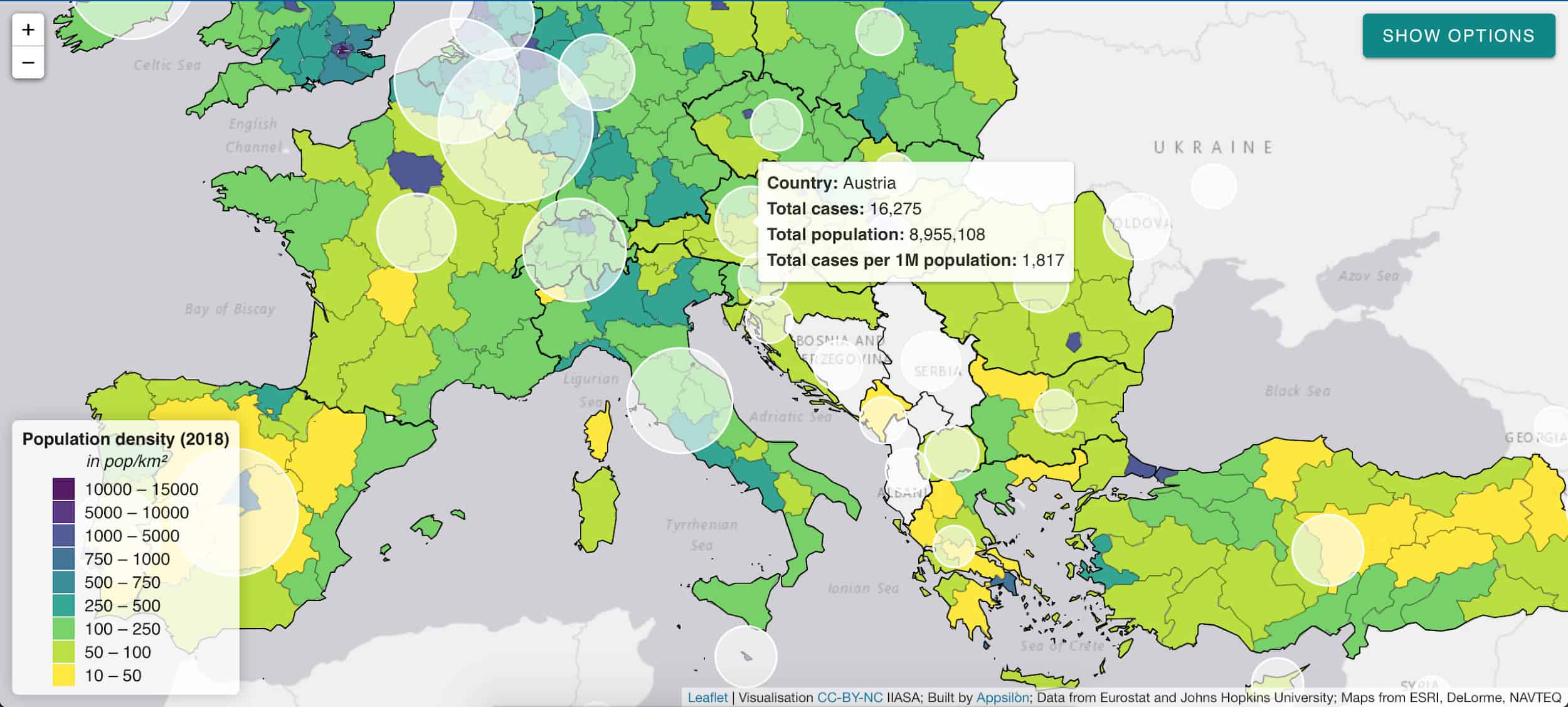
IIASA responded to this need with a regularly updated website and data report: “COVID-19: Visualizing regional socioeconomic indicators for Europe”. The reader is introduced to a range of demographic, socioeconomic, and health-related indicators for European Union member countries and sub-regions in five categories:
- Current COVID-19 trends – information about the number of cases and effectiveness of policy response measures
- Demographic indicators – age, population density, migration
- Economic indicators – GDP, income, share of workers who work from home
- Health-related indicators – information about healthcare system capacity
- Tourism – number of visitors, including foreign
The indicators and data were chosen for their value in assisting epidemiological analysis and balanced policy formulation. Policymakers often face the challenge of prioritizing pandemic mitigation efforts over long-term impacts like unemployment, production losses, and supply-chain disruptions. IIASA’s series of maps and graphs facilitates understanding of these impacts while maintaining the focus on containing the spread of the virus.
Our collaboration – a dashboard for policymakers
Having taken the first step to disseminate the data as information in the form of a mapbook, Asjad Naqvi decided to make these data even more accessible by turning the maps into an interactive and visually appealing tool.
IIASA has previously approached Appsilon Data Science with a data visualization project, which had us improve the features and design of Visualize, a decision support tool for policymakers in natural disaster risk management. Building on this experience, we set out to assist Naqvi with creating a dashboard to deliver the data to end-users even faster.
The application allows for browsing through a list of 32 indicators and visualizing them on an interactive map. The list is not final with indicators being regularly reviewed, added, and retired on a weekly basis.

White circles indicate the number of cases per 1 million citizens.
The application will continue to provide the latest and most relevant information to track regional performance in Europe also in the post-pandemic phase:
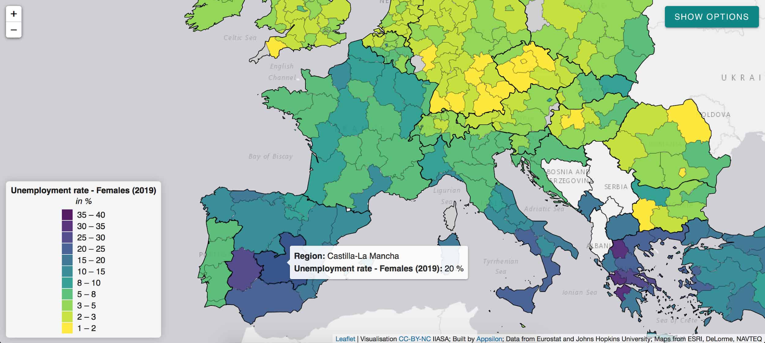
The pandemic has a disproportionate impact on women’s employment and revealed some of the systemic inequalities.
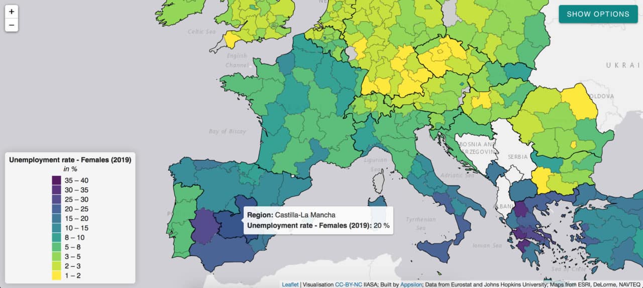
Social distancing measures, for instance, have a large impact on sectors with high female employment rates. The closure of schools and daycare facilities particularly affects working mothers. Indicators such as female unemployment rate can inform appropriate remedial action in the post-COVID world and highlight regions of special concern like Castilla-La-Mancha in Spain.
Given the urgency of the pandemic emergency, we managed to develop and deploy this application within five days. We believe such partnerships between data science consultancies and research institutes can transform the way policymakers utilize data. We are looking forward to future collaborations with IIASA and other partners to help transform data into accessible and useful information.
This project was conducted as part of our Artificial Intelligence for Good initiative. The application is available to explore here.
Note: This article gives the views of the author, and not the position of the Nexus blog, nor of the International Institute for Applied Systems Analysis.
Jun 5, 2020 | COVID19, Demography, Health, IIASA Network
By Tomas Sobotka, Wittgenstein Centre for Demography and Global Human Capital (Univ. Vienna, IIASA, VID/ÖAW), Vienna Institute of Demography
Does COVID-19 affect men and women differently? Tomas Sobotka sheds light on the demographics of the coronavirus pandemic in Europe.

© Florin Seitan | Dreamstime.com
A question from a Time magazine article has a clear underlying message: “Why is COVID-19 striking men harder than women?” By now, everyone has learned that men are more vulnerable to COVID-19 and, if infected, they tend to die much more often than women.
Are men however also more likely to get infected? On the face of it, the number of infections by gender suggests an almost perfect gender equality. Women represent on average 47% of all infections in 70 countries reporting the number of cases by sex, as listed in the online data tracker by Global Health 5050.
Case settled? Not quite yet. The aggregated total number might be deceiving. To understand an underlying story, one has to dig into the age and sex components of total infections. The overall balance of COVID cases by gender is an outcome of age- and sex-specific patterns of infection rates and the actual age- and sex composition of the population. This in turn, is often gender-unequal, especially at older ages, due to excess mortality among men and higher longevity of women.
In fact, in ten European countries I examined with colleagues from the Wittgenstein Centre for Demography and Global Human Capital, including Raya Muttarak from the IIASA World Population Program, it turns out that infection rates are highly gendered, especially when looking at the age pattern of coronavirus infection. From the teenage years up until their late 50s, women are more likely than men to be infected with COVID-19. Women in their 20s display the biggest gender gap in infections: on average only 64 men were infected per 100 infected women aged 20-29. After age 60, the pattern reverses, as infection rates among women drop at age 60-69 and the male infection rates go up or stay stable. This crossover is also clearly visible in the charts for Belgium, Czechia, Germany, and Italy. Between ages 60 and 79, men are more likely than women to be infected. The imbalance is sharpest among people in their 70s, with an average of 136 infected males per 100 infected women. This puts older males at a double disadvantage: they are more likely to be infected and, once infected, they are much more likely to die (with both higher age and being a male identified as important risk factors).
Is our evidence credible? Clearly, many infections are undetected and our data are affected by different testing availability and testing priorities across countries. It is possible that women of working age get more frequently tested than men as women tend to be more concerned about their health. This would bias the estimated share of infected women upwards. However, the remarkable regularity in the age- and gender-pattern of infections in the analyzed countries suggests that the observed gender disparities are real. The same gender disparity by age is observed in Czechia, Denmark, Germany, and Norway with relatively few infections, as well as in Belgium, England, Italy, and Spain with high numbers of reported infections. Of course, countries differ in their gender imbalance, especially at younger ages: the gender gap is, well, gaping, in Belgium, which reports only 34 infected men per 100 infected women at age 20-29. It is much smaller in Czechia, Germany, and Norway, but the female dominance at young ages and the male dominance at older ages, with a crossover around age 60, is consistently found in each society we studied.
What’s the likely explanation? At younger ages, the smoking gun points at women’s employment and occupations. Most women of working age in Europe are employed. This may also partly explain why European countries actually register a higher number of infections among women than most other countries, with an average share of 55%. More importantly, women are often working in professions that are most exposed to the infection. Think of nurses, medical doctors, other healthcare professionals, but also all the care workers in retirement homes, which turned out in some countries to be the focal points of infection. The switch in gender balance occurs right around the retirement age. The higher likelihood of infection among older men is probably linked with their poorer health and lower immunity.
If employment is potentially risky for women, staying at home with children—itself a product of ingrained gender inequalities in work and care—may lead to fewer infections. In countries where women’s employment dips after age 30 due to their extensive parental leaves, infection rates often show a distinct dip after that age as well, going up again in their 40s: Czechia, Germany, and partly Norway and Switzerland show such an M-shaped pattern of infection rates among women.
Even though the fatality rates of women below age 60 are low, engagement in care-work poses a higher risk to healthcare workers and care-home staff. This factor should be included in the ongoing discussions on the impact of COVID-19 on women’s health and wellbeing.

COVID-19 infection rates by age and sex per 1,000 population (solid line for females, dashed line for males, left-hand axis) and the relative M/F ratio in infection rates by age in four European countries
This blogpost is based on the following paper:
Sobotka T, Brzozowska Z, Muttarak R, Zeman K, & di Lego V (2020). Age, gender and COVID-19 infections. medRxiv 2020.05.24.20111765. DOI: https://doi.org/10.1101/2020.05.24.20111765
References
Global Health 5050. COVID-19 sex-disaggregated data tracker. https://globalhealth5050.org/covid19/ (accessed May 18, 2020)
Ducharme J. Why Is COVID-19 Striking Men Harder Than Women? Time, 1 May 2020. https://time.com/5829202/covid-19-gender-differences/
Note: This article gives the views of the author, and not the position of the Nexus blog, nor of the International Institute for Applied Systems Analysis.
Apr 15, 2020 | Austria, COVID19, Demography
By Erich Striessnig, researcher in the IIASA World Population Program
Erich Striessnig discusses the risks posed by the current COVID-19 pandemic and shares insights from his latest research around socioeconomic indicators related to the pandemic in Austria.
© Bennymarty | Dreamstime.com
Late last year, my IIASA colleague Raya Muttarak, Roman Hoffmann from the Vienna Institute of Demography/Potsdam Institute for Climate Impact Research, and I were informed by the City of Vienna that our proposal to study “Climate, Health and Population” (CHAP) in the metropolitan area of Vienna had been granted funding for the 2020 period. Originally, we wanted to study what climate change and demographic change in the rapidly growing Austrian capital implies with regard to future vulnerability to extreme weather events. As the city is booming with economic activity and experiencing more tropical summer heat every year, the extent of the urban heat island increases as well, thus posing a steadily increasing risk to the city’s growing population, especially the elderly.
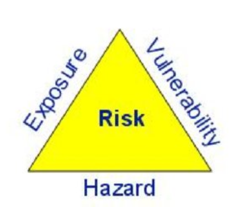
One conventional way of thinking about a population’s risk in the context of climate change is to decompose the risk and focus on its individual components. According to the famous “risk triangle” after Crichton, risk equals hazard times exposure times vulnerability. If any of the three can be taken out of the equation, the risk is reduced to zero … much like in the absence of sun, even the palest person can safely go outside without sunscreen! If, however, the hazard is there, people would be well advised to either not expose themselves to the sun or to reduce their vulnerability to skin damage and cancer by wearing sunscreen.
Now what does that have to do with our current predicament of a vast fraction of the world’s population being quarantined due to the outbreak of COVID-19? Well, as we and our CHAP colleagues were waiting for the meteorological data necessary for answering CHAP’s main research questions, we thought that we could focus on this much more imminent threat instead. In some way, the risk posed by COVID-19 can be viewed under the same lens as the above risk equation:
In terms of hazard, COVID-19 represents an unprecedented shock to social and economic systems and thus has a lot in common with climate-induced natural disasters. As humans are the carriers of the disease, the number of infected people in a local area can be considered as the hazard estimate. Meanwhile, by employing physical distancing (while remaining socially very active and helping, in particular, those around us that are in a more dire situation), we can lower exposure to that hazard a great deal and the risk can be reduced decisively. While under a business-as-usual scenario, our health system would soon find itself overwhelmed by an unbearable demand for health care, eventually having to give up lots of patients. The quarantine measures imposed in many countries serve to lower exposure and subsequently “flatten the curve”. So in order to reduce your own risk exposure and avoid increasing the risk for others, everyone who can afford to, please stay at home!
Likewise, we can to a certain extent work on lowering our vulnerability, both at the individual and at the societal level. Not everyone is equally vulnerable to the disease. As in the case of facing the challenges of climate change, populations faced with this pandemic are characterized by demographic differential vulnerability, expressed by the fact that the virus is more (but certainly not exclusively) lethal for older people, as well as those with preexisting health conditions and weakened immune systems. To reduce our individual vulnerability (in case we are exposed to the hazard), we can work on strengthening our immune systems.
At the societal level, we can reduce risks by identifying those places where the disease outbreak might have the strongest impact. For this we need suitable indicators available with sufficient spatial granularity. The initial, pre-lockdown infection hotspots, were often places that are well connected, such as travel hubs and touristic areas. In some cases, though, these hotspots were created simply as the consequence of bad luck, in other words, because there was a local “super-spreader” or a social event that brought together a large number of people. Such situations can hardly be anticipated. What we might be able to anticipate, though, are those vulnerable geographical hotspots where, given the pre-existing burden of disease, as well as the demographic and socioeconomic characteristics of the people that live there, the pandemic might cause the most havoc.
In line with the work by our IIASA colleague, Asjad Naqvi, we set out to map various indicators at the Austrian and Slovak municipal level (Slovak data courtesy of Michaela Potancokova from the IIASA World Population Program). Our indicators include things like the proportion of elderly population (>70+) or population density, but also the proportion of people with low socioeconomic status or a region’s connectedness in terms of the proportion of population commuting for work. These indicators can have varying importance in the short, medium, and long term — while mobility is no longer a big issue now that the population is in lockdown, socioeconomic characteristics, for example, may play a bigger role the longer the crisis lasts. While at the initial stages, Austrians with higher socioeconomic status were more likely to get infected due their mobility and larger social networks, the socioeconomic gradient might turn around eventually and those with lower social status might carry the brunt of the pandemic, as they are more likely to become unemployed and stay there for a longer period of time.

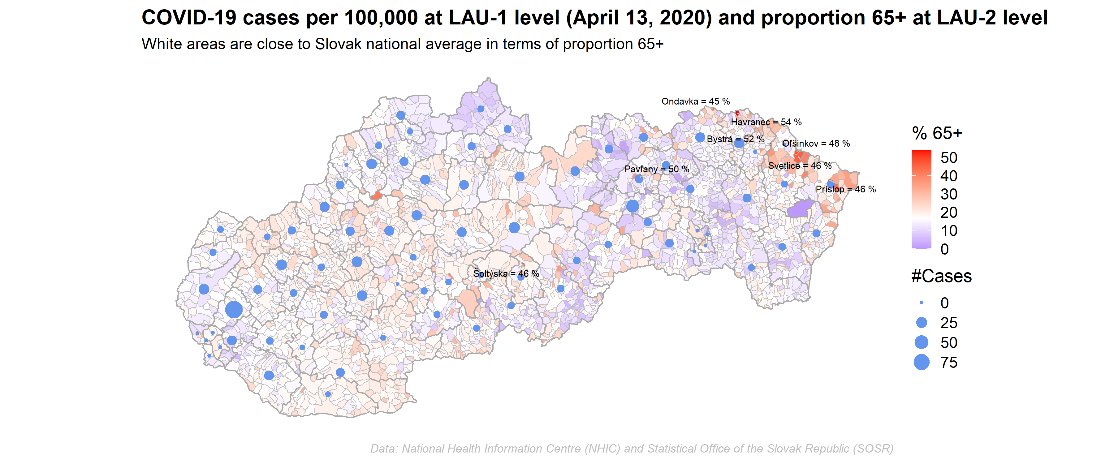
Our work to create a meaningful risk index from such vulnerability indicators is still in progress, but we aspire to pinpoint which areas are most likely going to need additional interventions, such as more testing or increased hospital capacities. This exercise will not only be useful at later stages of the pandemic, that is, when we slowly start moving back from the current quarantine situation (“The Hammer”) to gradual normalization (“The Dance”), but also when faced by other types of risks, such as from climatic hazards or economic shocks.
Note: This article gives the views of the author, and not the position of the Nexus blog, nor of the International Institute for Applied Systems Analysis
Jan 29, 2020 | Demography, Health, Wellbeing
By Sonja Spitzer, research assistant in the IIASA World Population Program
Sonja Spitzer discusses how survey data often fails to capture all socioeconomic groups and explains how to ensure health information used by policymakers is based on accurate statistics.

Life expectancy continues to increase in Europe. We live longer, but do we live healthier? One way of tackling this question is by analysing health expectancy: a widely used indicator that counts the number of years an average person can expect to live in good health. To create this indicator researchers usually combine information about mortality with health data from surveys – and this is where many problems begin.
Survey participation is shaped by socioeconomic differences
Surveys do not always correctly represent the countries they seek to describe. A common deviation is that highly educated individuals are more likely to participate in surveys than less-educated individuals This is problematic for health research in particular, because highly educated people tend to be healthier than those who are less educated. Overrepresenting healthy and better educated individuals in surveys makes countries appear to have healthier populations than is the actual case. A recent study I conducted, that focused on European countries, showed that health expectancy measures are frequently upward biased, because less-educated people are underrepresented in the underlying data. The results of this study reflect the outcomes of other research; for example, estimates of rates of diabetes and asthma in Belgium are too low because individuals with a high level of education are overrepresented in the core data. In the Netherlands, the underrepresentation of those with lower levels of education has led to underestimating smoking prevalence, alcohol intake, and low levels of physical activity.
Make everyone count with statistical weights
Are you now wondering if you can ever trust health measures again? Do not despair! Surveys can still be a very useful source for answering health-related questions if the appropriate statistical tools are used. It is possible to account for the misrepresentation of participants with lower levels of education in surveys. The only thing needed is accurate information about the education structure of the population, that is: How many highly educated versus less-educated individuals live in a given country? In Europe, this information is readily available via censuses. Using information from censuses makes it possible to calculate statistical weights for surveys. If the less educated are underrepresented in surveys, each observation of a less educated individual is weighted relatively more than those with a higher level of education to account for the misrepresentation. This weighting enables surveys to resemble the population in the real world and the health measures that are based on them to no longer be biased by educational differences in survey participation.
Why do the less educated not participate in surveys?
Using survey methods such as statistical weights might become even more necessary in the future – it appears that the gap in survey participation between the higher and the less-educated is increasing year upon year. Those with low levels of education are frequently more difficult to engage, for example, less educated people can have less stable life paths and thus more often change their address. They may be less likely to provide requested information in surveys because they are too sick to participate or are less aware of the details of their health and financial situation. Finally, survey participation is usually voluntary and those with lower levels of education are more likely to refuse participation. One could speculate that this refusal to participate is because we, as researchers fail to engage with, or reach out to, less-educated individuals and the “value” of participating in surveys is therefore not well-communicated. This concern seems particularly important in the age of ‘fake news’. If less-educated individuals were better represented in surveys, this would make official statistics more reliable and might also lead to a better appreciation of statistics and how they can be more profound indicators than, for example, an opinion posed by someone on TV.
References:
[1] Demarest, S., Van Der Heyden, J., Charafeddine, R., Tafforeau, J., Van Oyen, H., Van Hal, G.: Socio economic differences in participation of households in a Belgian national health survey. European Journal of Public Health. 23, 981–985 (2013). DOI:10.1093/eurpub/cks158
[2] Korkeila, K., Suominen, S., Ahvenainen, J., Ojanlatva, A., Helenius, H.: Non-response and related factors in a nation-wide health survey. European Journal of Epidemiology 17, 991–999 (2001)
[3] Reinikainen, J., Tolonen, H., Borodulin, K., Härkänen, T., Jousilahti, P., Karvanen, J., Koskinen, S., Kuulasmaa, K., Männistö, S., Rissanen, H., Vartiainen, E.: Participation rates by educational levels have diverged during 25 years in Finnish health examination surveys. European Journal of Public Health. 28, 237–243 (2018). DOI:10.1093/eurpub/ckx151
[4] Spitzer, S., Biases in health expectancies due to educational differences in survey participation of older Europeans: It’s worth weighting for. The European Journal of Health Economics. (2020) IIASA doi:10.1007/s10198-019-01152-0. http://pure.iiasa.ac.at/id/eprint/16281/
Note: This article gives the views of the author, and not the position of the Nexus blog, nor of the International Institute for Applied Systems Analysis.

You must be logged in to post a comment.